Geometry and Landscape Narrative
Tivoli, Italy

image: Sam Valentine
Criticism was not the first thing to come to my mind when I visited Villa d'Este. This epic Italian estate garden in is a landscape of drama, force, and grandeur.
All that said, the more time one spends on the grounds, the more likely it is that he or she starts to notice cracks in the garden's veneer. The flaws only emerge after the sense of amazement settles down, but from the best I can determine, these defects are not the result of five centuries of wear and tear; rather, they are evidence of flawed design execution. As I describe the imperfections I found at Villa d'Este, the reader will hopefully consider each one as a learning opportunity to be applied to the landscapes experienced closer to home.

images: Archi/Map (colored lines by Sam Valentine)
Dishonesty - The landscape's largest imperfection is its spatial layout. The designer based the garden plan on a strong, hierarchical grid of axes, but in doing so he made too many compromises. Comparing the "drawn" and "actual" plans above, it is quickly apparent that the rectilinear concept was imperfectly forced onto the native topography.
There is certainly no blanket rule requiring a designer to flatten land and carve hills straight, and a short glance at contemporary landscape architecture projects proves that the orthogonal grid is anything but in vogue. However, when a landscape designer imposes a formal grid on landscape topography, he or she is setting unyielding expectations for straight lines and right angles. The misalignment of the upper terraces revealed itself to me not in plan but in perspective: looking up Villa d'Este's most significant axis to the palace proved that something was amiss.

images: Carl Blechen and Sam Valentine
Disneyfication - If you are not yet familiar with it, this term describes the tendency of some designers to create architecture or landscape that is tawdry, flashy, or otherwise best fit for tourists. To be sure, Cardinal Ippolito II d'Este predated Walt Disney's theme parks, but from his miniaturized "La Rometta" to the discrepancy between interior and exterior treatment of the garden walls, the garden often seems to have all the authenticity of a movie set.

images: Sam Valentine
Lack of a Master Plan - With only a few exceptions, Villa d'Este favors local symmetry over broad consistency. Walking the garden feels a bit like reading masterful literature had the pages been shuffled in the wind. While the landscape is technically arranged on an organizing grid, it lacks a cohesive master plan.
This blog hopefully will not lead the reader to believe that Villa d'Este should be looked down upon as a failure; the fact that this is my fourth consecutive post on the same landscape should serve as evidence of both the garden's importance and its greatness. A keen student of landscape, however, should analyze this garden and -- with the distinct benefit of 500 years of hindsight -- take lessons from Villa d'Este back to the landscapes of their own lives.
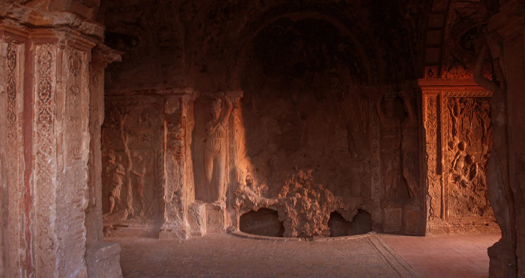
image: Sam Valentine